Tuesday 3 July 2012

Fashion Resit: Deconstruction


Fashion Constructed Image Resit.

Deconstruction of Fashion images.


The images I have chosen to look at are a set from Harper’s Bazaar of Kate Moss, taken by Terry Richardson.

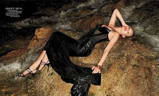
The set consists of 19 images, showing the model (Kate Moss) wearing the clothing from the recent summer collections. The images are split into two styles, daytime shots and night shots, which alternate throughout the set.  The images are arranged as full portraits, one per page, occasionally broken up with a double page spread.

The model for these images has been chosen for many reasons. Her figure is what a lot of women would call ‘ideal’, and aspire to look like, especially during summer.  The model has also been chosen to compliment the location. Set in a tropical environment, it suggests a ‘jet-set’ holiday and lifestyle, which is further emphasized by using Kate Moss, who is one of the most well known and highest earning supermodels at the moment.

The clothing worn also ties in with this perfect lifestyle, with most items costing thousands of pounds. As far as style and colour goes, the clothing is predominantly black (apart from the two black and white images, in which she is wearing white), and doesn’t feature any other colour apart from in the night images. In these, the use of colour is bold, and the attention is drawn away from the location and focused fully on the model.

The makeup and lighting changes completely between the night shots and the day shots. During the day time shots, the make up, along with the lighting, is much softer. The day images look as though soft-boxes are used to light the model, with natural lighting for the background.  The make up is more natural, which compliments the natural environment in which the model is set. The hair also follows this style, being let down in most of the day time photographs and giving the model a more relaxed look which is also shown in her poses in these shots.

In comparison to this, the night time shots look a lot more serious. The model takes a much stronger approach to her look. Her posture is much more rigid and firm. Throughout the majority of the photos, she is looking directly into the camera, which makes a connection with the viewer, but in the night images, this makes it almost like she is confronting the viewer. This is mimicked with the change in the models change of hair and makeup. A bold red lipstick making her stand out, whilst her hair is tied back. This look is emphasized by the use of much stronger, harsher lighting. The light looks as though it is coming from straight on, possibly using a ring flash.

For each individual image, the models relation to the environment has been carefully considered. The photographer has used the locations perfectly in regards to how he positioned the model within them, in some of the images, making the model mimic natural lines within the landscape and interacting with it.

Fashion Constructed Image: Retake Task 2

To realise this project, i would need to be better prepared and better planned than in the previous set build.

My first priority would be to make sure that everything was ready for the beginning of the build. The wallpaper would need to be printed and purchased a week before, and made sure that we had enough to fit the space we were creating. Next, i would make sure that we had a door, and all the fittings to attach it.
In regards to the casting, i would make sure the model was completely free for the shoot day to avoid having to find a quick replacement. Also, i would go over with the model how we expect him to pose and get him into the mindset that we need for the shoot.

During the setbuild week, specific jobs and plans would need to be in place to make sure everything runs smoothly and gets done on time. By the end of the first day, i would want all of the walls to be built, with the door installed. On the second day, the wallpapering can be done and finished before the end of the day, leaving time to start to set up some initial lighting. This would give us all of the third day to complete the difficult task of arranging and correcting all the lighting. By the fourth day, we would be ready for the model to walk on set first thing, and begin shooting, with one of the group directing him in regards to poses that would previously have been researched. Leaving day five for an easy strike of the set.

Fashion Constructed Image: Retake Task


Fashion Constructed Image.

For our concept, we explored three completely different themes, Film Noir, Protest, and Pop Art. After further research of all three concepts, we chose to go with Pop Art. Are main reason for this choice was the deeper meanings behind a lot of pop art work , especially with Andy Warhols work. It was a major comment on anti-consumerism.

Out initial thoughts started with keeping the pop art theme traditional, and making our set in a 70’s style. The main themes we wanted to explore were the use of bright colours, repetition, and consumerism.

The way we want to show this is through a series of walls. We want to create walls out of products in 3 different, bold colours, with a passage leading through on which the model is meant to have blindly walked down. The walls and rooms need to look like they are bottomless, and that the model has only noticed he is on this path once the path has been taken away from him.


This is an example of one of the walls. We will need to photograph the products individually, and then arrange them to be printed off as wallpaper.

This is how the set will be laid out.


The character we are looking for needs to be something along the lines of this:

A classic 9-5 office worker, who is stuck in a cycle of working to earn and earning to spend. As it is a fashion shoot, they need to be styled better than this, but still in keeping with this theme.  Using grey/dark colours as a contrast to the bright background.

Our casting consisted of 9 different people, only a few of whom properly fit the character we were looking for.


Our chosen model we felt was perfect for the shoot was Brendan. We liked his general look, which was between a 9-5 worker, and a gleaming corporate poster boy.

The idea behind out model is that he is a normal guy who is caught up in the day to day life of a consumerist world. He is completely unaware of the fact that he is in this world until somebody literally takes the floor out from underneath him. For the shoot, we want him to be wearing a suit, but there are many different types of suit. As this is a fashion shoot, it needs to be of a slightly better cut than a normal office job suit, but not posh.


In the end we settled on a standard 2 button suit in grey.


To test the suit and see how suit and model stood up to some harsher lighting, i used my own ringflash to photograph the model in the suit. We were pleased with the results, and how the suit looked on the model.


The lighting we want to use needs to copy the clean cut, corporate look used by most of these big businesses, especially in their advertising. Due to the complexity of the set, a lot of lighting will be needed, and carefully placed in order to get an overall exact exposure setting.


This is the intended plan.  In total, 10 lights will need to be used for the shoot. As we liked the harsh glare of flashes, we want to use flash to light and highlight the model, whilst using continuous lighting to light the rest of the set. The flashes will be a different colour to the continuous lighting, so they will need to be adjusted.

Monday 28 May 2012

Fashion Constructed Image: Critical Appraisal

With this project, we were faced with many different challenges. Working as part of a team, we started by developing a concept around the ideas of anti-consumerism. We wanted to show how the everyday man is surrounded and controlled by the large corperations. We started by looking at such astists as Andy Warhol, and how he used his art as a political statement. From there we we developed many different set ideas, taking influence from his work, and other artists such as Chris Jordan, aswell as scenes from the film Hurt Locker. After much work and many different set concepts, we came up with a final idea, that incoorperated all of the ideas we had into one set.

For our casting, we started searching for someone who looked like they worked a 9 to 5 office job, not unsimilar to a character you would see in the television programme 'The Office'. My search started with studens of the university, and spread out to other people we didnt know. We cast around 12 people for the shoot, narrowing it down to two models, Tom and Brendon. Tom was our main choice of model, but due to other commitments, had to pull out last minuite. Luckily Brendon was more than willing to fill in for us. Styling our model, we wanted to make him look smart, but not someone who stood out. Even though this was a fashion shoot, our piece was very much against the idea of mass consumerism. We looked into many different styles of suits and colours before settling on a simple blue suit with white shirt and tie.

I think the building of the set was one of our weakest parts of the project, purely through lack of proper planning and a lack of team management or structure. Our build started off rocky, but after the first day we had everything planned and were well ont he way to building the set. Once the set was built and lit, we spent a good 5 hours trying to find the right pose for our model. We wanted him to look as though he was lost and falling through this world of products. From a final 5 we had chosen, we picked one and begun post production.

I found that our image didnt have as many flaws in it as we had first feared, so post production was a fairly short process.

Overall, i feel we did our concept justice with this project. Our final image, whilst keeping some elements of a fashion image, still upholds the ideas we were trying to convey. The only thing i felt we faild at as a group was communication and preparation. Because of this, our first couple of days building suffered and we were left to rush the build.

Saturday 19 May 2012

Fashion Constructed Image: Post Production

Once our final image had been chosen, I had to start work on the post productrion of the image. We knew this would take quite a bit of time as there were many imperfections with our images and in our set. The first thing i did when exporting the image into photoshop was to create some guide lines for where the image would be cropped.


These lines helped me to notice that the perspective of the wall was all wrong. During the shoot we were forced to use a wider angled lens than we had planned for, so there were al sorts of distortions in the image that needed to be corrected.

Once this had been done, i started working on the global adjustments that would apply to all layers and adjustments done after this. These were the levels, curves, and the colour balance. All of these adjustments were made through layer effects so as not to completly change any of the pixels in the image. I started off by adjusting the colour balance, to try and make the reds blues and yellows as strong as possible.


Once i was happy with the colours, i realised that the adjustments had changed the colours in the models hand to a dark purple. This is something that can be readjusted later through Local Adjustments.
Next i made a levels adjustment layer to try and even out the light balance and increase the tonal range.


This also improved the colours in the image. For our final global adjustment, we adjusted the curves only slightly which increased the contrast.


Next, i had to start on the more localized adjustments that needed to be made, for example, removing unwanted shadows, local colour adjustment, local contrast adjustment and airbrushing. As we were not allowed to go over the top with the photoshop adjustments, and werent allowed to adjust any pixels on the original image, all of these adjustments had to be done through masks and layers.

My starting point for these adjustments was to remove the large shadow cast above the models head on the inside of the door.

To do this, i created another level, and used the spot healing tool. There is an option with this tool to allow sampling for the tool to be taken from all levels and not just the current one. Selecting this meant that i could sample from the base level, but create onto a new one. Once id done that, i just blended in the new piece of doorframe with the existing frame using a soft brush.

The next major adjustment that needed to be made was to the bridge between the doors. We all agreed that it needed to be smoother and more constant without the intruding shadows.
 To do this, we created a selection around the entire path, and turned this into a mask. On a seperate layer, we filled this mask with a gradient to represent the pathway. Afther this, we adjusted the opacity of the mask and layer to blend it into the image. This was probably the hardest part of the adjustments we made to the image.

Then came the adjustments to the hand colour of our model. Again this was done by making a selection around the hands, creating a mask, and making the adjustmnts onto another adjustment layer.


This was the end of the major adjustments. The only few things that needed to be changed were the brightness and contrast of the blue and red walls. The red wall through our lighting choices had ended up with a large vignette around the outside. This was easy enough to solve. I selected the areas that needed to be brightened, added a gradient to them to blend in with the already bright areas, and then created another adjustment layer to change the brightness.


I repeated this process twice, once on the left and once on the right, being careful to keep the adjustments even as i didnt want one side to be brighter than the other.

The last adjustment that needed to be made was to darken down and add contrast to the blue wall on the inside. This i decided to do with the levels rather than the brightness and contrast tool.


After adding an unsharp mask to the image, we were left with our final image.


Monday 14 May 2012

Comission: Layout and Design


For the layout and design of our newspaper, i read through a few different examples, but mainly focused on The Guardian for our project. The newspaper is very consistant with its layouts.


 The text layout is set into 5 collumns, which continues through the paper, and images are placed onto the pages, with the text working around the images within these columns. Also, there are alot of page break lines used to seperate different stories on pages, as each page usually contains 2 or 3 stories.

In the design, the paper comes up with around 20 different page layouts, and then reuses them throughout the paper with different stories and images. Depending on the seriousness of the story, the size of the image changes. More important stories have more space allocated to them, between 3 and 4 collumns wide, where as smaller stories have images between 2-1 collumns. Even with the larger stories, there is usually a relating side story which is found in the side column.

Using this research, i started to come up with a rough idea for the layouts for our newspaper:

I came up with 6 different layout possibilities. These were just rough sketches, so i didnt stick to a certain number of collumns for text, but i think for our newspaper, 4 collumns will be enough. As we dont have a large number of stories to work with, there would be no need to put in small side stories around the photos, thus giving the oppertunity to print the images larger, and giving space for the more important stories we wish to feature.

After making these 6 designs, i decided to get a real idea of how these would look layed out in a news paper. To do this, i made a half scale newspaper, and started to plan out the layouts page by page. The scale model included the 15mm border around each of the pages, and started to give an idea of spacing between images and text, and how they would relate to eachother within a story.


These are some scans of the first 3 pages, showing the layout and positioning of texts.

Monday 7 May 2012

Fashion Constructed Image: New Model

Two days before our shoot week, and we have hit a problem. Our model, Tom, has unexpectidly had to pull out of the shoot due to other commitments. Luckily we kept in contact with a few of the other models we originally cast for this shoot. Our 1st choice for back up is Brendon, who has gladly agreed to take part.


We didnt really know how brendon would look for the part, as we had completly settled on the other model and shot test shots of him in preperation, so we decided to do a quick test shoot with Brendon to make sure he would suit our shoot.


Unfortunatly as it is the weekend, we couldnt get into a studio to do proper test shoots, so i made do with a plain white wall and my flash. We dressed him in the suit that we had already bought to make sure it fit, styled his hair and took a few pictures. After seeing the images, we were happy that he would be able to fill the slot and work well with out concept.