I have already looked at Burtynsky for other projects, but as his work is so relevant to the issues i am looking at in this project, i decided to revisit him. This time, i was looking into is work on Metal Recycling.
This set of images focus on the massive amount of metal recycling done in Ontario, Canada. The way he emphasises this is to fully fill the frame with these recycled parts in the image. The images are all taken in colour and inclued an enormous amount of detail, which leads me to believe that they were taken on large format. This is very similar to what i want to try and convey with my project. The only issue i face is that many companies aren't willing to let someone on site to photograph. Im going to try and find a new angle on the project that will allow me to photograph this idea of waste and recycling, without having to tresspass and break into places.
Saturday, 3 March 2012
Sunday, 26 February 2012
Fashion Construsted Image: Progression of Concept
Initially inspired by Andy Warhol, our 60's themed shoot has changed somewhat from when we started. After further research into his work, and work of other artists around at this time, a common theme of anti-consumerism became apparent. This was an idea that we all liked, and wanted to put into the work, but were struggling to find away of doing this, whilst still keeping with the 60's style.
After our tutorial, we came to the conclusion that we should completly focus on anti-consumerism, and came up with a new idea to show this. We decided to drop the 60's theme almost completly, although we still wanted to show the repeatativeness and bold colours of Warhol's work.
This new idea involved having a model laying on a sheet of perspex, covered in products of a certain colour. These products would be from big coorperations who have recently been in the news for doing something wrong. Initial ideas for these products came from this website:
http://brainz.org/15-deadliest-us-corporations/
What we want to do eventually, is create a trip-tych, in red blue and yellow, with products from these and other coorperations. As far as the set building is concerned, there isnt very much that actually has to be built, but the logistics of making a project like this work will be hard. As well as this, there are alot of health and safety aspects to look at.
Tuesday, 21 February 2012
Comission: Initial Ideas
The idea that i want to look at for this project is the waste management around the Medway area. We are currently in the process of lowering our waste and landfil usage. In 2004, the medway area produced 141,000 tonnes of waste, and since then a plan has been put into action to reduce this number to 24,000 tonnes by 2020. I want to look at what actions are being taken to do this, and to photograph the people who have to deal with this waste on a day to day basis.
I intend to visit a landfill site on the nearby Isle of Sheppy, as well as visiting 3 local household waste and recycling centers in Cuxton, Gillingham and Chatham
information found through:
http://www.medway.gov.uk
http://www.medway.gov.uk/pdf/medway-waste-management.pdf
I intend to visit a landfill site on the nearby Isle of Sheppy, as well as visiting 3 local household waste and recycling centers in Cuxton, Gillingham and Chatham
information found through:
http://www.medway.gov.uk
http://www.medway.gov.uk/pdf/medway-waste-management.pdf
Tuesday, 14 February 2012
Fashion Constructed Image: Guy Bourdin
The style we want to go for with our set and shoot is influenced by these images by Guy Bourdin. The use of solid bold colour is somehting we wish to use in our sets. Work from the pop art era is known for its strong, contrasting colours, and these images look like they have been influenced by that style.
Fashion Construsted Image: Initial ideas
To start off the project, as a group we came up with 3 different ideas, and created mood boards for each of these. The first idea we came up with was the idea of Film Noir. Our mood board contained references to the lighting, fashion and stroylines of films from the 1940/50's, aswell as artists who has already tried to recreate this style. Of the three ideas we thought of, this seemed to be the easiest to achieve as a studio project. Because of this, we decided to continue on another idea that would push our skills more.
The second idea we looked into was protest. With the amount of protests and riots that have been going on around the world recently, it seemed like an interesting subject to look at for a fashion project. We looked at what protesters and rioters wore, as well as looking at the reasons behind their protests. The meaning behind the image would have been good to look at, although it seemed like a difficult task to create in a studio invironment, as most of these events take place on the streets.
The third idea was the one we eventually settled on. The theme was Pop Art, and 60's culture. Inspired by the work of Andy Warhol and his stance on anti-consumerism, we looked into the fashion of the 60's, aswell as the style of the art that was being produced at the time. We liked the repatitiveness and simplicity of the art, and felt it would be a good project to do.
The second idea we looked into was protest. With the amount of protests and riots that have been going on around the world recently, it seemed like an interesting subject to look at for a fashion project. We looked at what protesters and rioters wore, as well as looking at the reasons behind their protests. The meaning behind the image would have been good to look at, although it seemed like a difficult task to create in a studio invironment, as most of these events take place on the streets.
The third idea was the one we eventually settled on. The theme was Pop Art, and 60's culture. Inspired by the work of Andy Warhol and his stance on anti-consumerism, we looked into the fashion of the 60's, aswell as the style of the art that was being produced at the time. We liked the repatitiveness and simplicity of the art, and felt it would be a good project to do.
Sunday, 12 February 2012
The Time Machine. Task 1
The Sleeping Venus - Giorgione
This image, painted in 1510 during the renaissance, depicts a naked woman lying down outside. The artist has gone to great length to create a sence of realism in the figure, and the same with the background, which was completed after Giorgione's death by Titan. The use of colour in the image is very important. Venus is the goddess of love, and the colour red is a symbol of love. This idea of love is also mimiced in the characters pose. She is elegantly draped on the cloth and pillow, covering herself with one hand, and resting her head on the other. This was controversial at the time, as it was one of the first paintings to feature a nude woman. The woman is looking out of the image, and you cant tell wether her eyes are open or not. The backdrop for this image is out on hills next to a building or small illage. The curves in the landscape start to emmulate the curves in the models body aswell as the curves in the clouds.
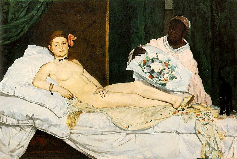
Olympia - Manet
This image although inspired by the previous, takes on a completly different feel. The artist isnt as concerned with realism, and instead focuses on the symbology in the image to portray its meaning. This time, the model is looking straight at the viewer, conveying a very strong expression. The posture of the model is also quite similar, although its alot more rigid, showing again strength in the character. The inclusion of the black maid was appropriate for the time, as in 1868 when this was painted, black people were seen as being lower class, and often used as servents or slaves. This image was also controvisial, as it showed this woman in very lavish conditions. The black cat in the image was a symbol for prostitution.
Saturday, 11 February 2012
Street Casting
Before a show in folkestone, everybody was gathered around the back of the venue. I decided to use my friend Gareth for the this street casting shot.
He was just stood by a car, drinking and smoking. This style is heavily influenced by the punk movement. The combination of sleeveless tops and tattoos is classic punk/rock. I chose the model mainly because of how he looked compared to where he was. He was standing outside a new, contemporary building, and it didnt look like the sort of place you would see someone dressed like this.
This was another image i took of the people standing outside the show. Another thing i noticed is that it is very popular to wear artists merchindise. This is something i want to look into further.
He was just stood by a car, drinking and smoking. This style is heavily influenced by the punk movement. The combination of sleeveless tops and tattoos is classic punk/rock. I chose the model mainly because of how he looked compared to where he was. He was standing outside a new, contemporary building, and it didnt look like the sort of place you would see someone dressed like this.
This was another image i took of the people standing outside the show. Another thing i noticed is that it is very popular to wear artists merchindise. This is something i want to look into further.
Subscribe to:
Posts (Atom)