Showing posts with label object. Show all posts

Thursday, 12 January 2012

Object/Body: Critical Appraisal

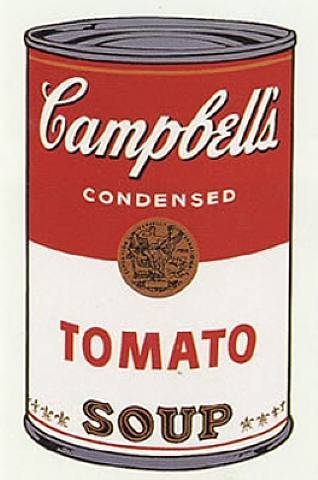
The Object project was one I found particularly hard. Still life isn’t a subject I found particularly interesting previously, and so I didn’t find myself really getting into the project. I decided to look at the idea of being a student, and the struggles that come with it. My initial inspiration for the project was the work of Andy Warhol, in particular his work “Campbell’s Soup Cans”. The repetitiveness of the pieces was very similar to what I found eating as a student was like. I then looked at Martina Mullaney’s work, called dinner for one, which looked at the eating habits of people who lived alone. Trying to show this in the studio was tricky. I used a single light to emphasize this feeling of being alone, whilst making a mess with the food to show the little respect for cleanliness students have.

The body project was probably the most enjoyable, and I think my most successful project. I started looking at the social status that comes with being tattooed, but my project evolved into how the public and employers view tattoos, and the discrimination shown towards them. I looked at the work of Richard Avedon, who’s work “In the American West” heavily inspired the styling of my pieces. I chose to present my work as a diptych, one image showing someone covering their tattoos, whilst the other showing them off. The point of the images is to show how differently people are seen when they have tattoos, and how we see them when we don’t know they have them. I found my model at a local hardcore gig in Chatham, and he was more than happy to help me with the project. I was happy with the final images, but I would have liked to have explored different ways of representing this idea.

Tuesday, 8 November 2011

Object: Martina Mullaney

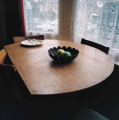
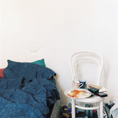
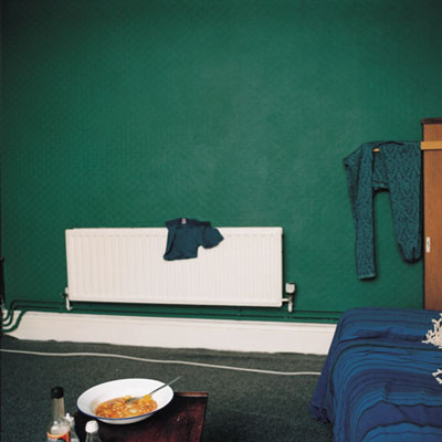
I was advised to look at the work of Martina Mullaney, in particular a project called "Dinner for One". The images she took for this project looked at people who eat/live alone, and the environments they live in. Looking at the images really inspires a feeling of emptiness and sympathy with the implied character. Her work is almost exactly what i wanted to do with this project, and it would have been nice to have seen her work before creating my own. By using very plain surroundings, and in some images using very large tables or wide open spaces to surround the meal really emphasize the lonliness off living alone.


Wednesday, 2 November 2011

Object: The Shoot

My object shoot was pretty straightfoward on paper, but when it came down to it, it took a long time and was hard to setup. I started by setting up my shot as i had planned it in my original sketch.

After setting up my still life like this, i quickly realised that there was no need for the second light source. After taking two photos, i really wasnt happy with how the image looked. It didnt really portray the student lifestyle that i wanted it to, it looked more like an advert for the beans. I decided that i needed to make it look messy, like a student had prepared the meal.

I had to be careful not to get any mess on the backdrop, so i uced some disposable white table mats to protect it. I then re arranged my lighting, as i was getting to much fall off lighting the backdrop. To do this, i had to susspend a flash directly above the subject using a boom stand, weighted to balance the flash. To further limit the light that was faling onto the background, i used a medium honeycomb. 


This was my final image:
 

As i couldnt get into the darkroom, i made a digital scan of the negative, and used photoshop to adjust the colours, to give me an idea of what i would like to do in the studio. I felt that giving the image a blue tint would emphasize the feeling of lonliness i had tried to make with the lighting.

Overall, i'm pleased with my final image. I think that if i had planned more ahead with my subject matter, and maybe put the subject into a location to give it context, then i would have been more sucessful with puting my point across.


Object: Critical Appraisal

Object: Self Reliance

I really struggled coming up with an idea for the object project. As still life isn’t something I really find all that interesting, it wasn’t easy to come up with an idea for it. I decided to start looking at things that were affecting me at the moment, and how I could show these through still life. Moving out for the first time, and becoming more independent, it gave me a lot to write about.

After struggling for the first few weeks with money, I decided to look into the struggles that face young students going to university, and how this is only going to get worse with the upcoming increase of tuition fees and the possibility of another recession.

A lot of still life paintings, especially around the 16th century,  were inspired by the current economic climate of the country they were from. For example, Dutch and Flemish painters would paint flowers, usually rare/expensive ones, as owning these paintings were seen to be a sign of economic status.

As art progressed, still live moved into photography, still with some sort of political or economic reference behind the work. I looked at the work of Shomei Tomatsu, who is famous for his photographs showing the aftermath of the Nagasaki/Hiroshima bombings in 1945.  In particular, this image of the melted bottle is something I looked at in great detail.

To represent my new found independence and struggle with money, I chose to look at the change in foods I was eating. This was in part inspired by Andy Warhol’s piece “Campbell’s Soup Cans”. The repetitiveness of this piece was very relevant to my eating pattern, as I was practically living off of beans on toast for the first two weeks.  This was due to my struggle with money and adjusting to living alone.

My initial photograph was just of a can of beans standing on a plate with a toaster in the background, but this seemed to clean and not very representative of student life, so I decided to mess the plate and props up, by pouring beans everywhere, and half eating the toast.  My choice of lighting was meant to emphasize the loneliness of living away from home, and I did this by using a singular focused light source, throwing everything else into darkness.

I found this project very hard to connect with, and I really struggled to change my ideas into reality, and successfully communicate my intentions. This is something I really need to work on in the future, especially with still life in the studio, as it is hard to establish a context for your subject.


Friday, 21 October 2011

The Object: Reasons for my work...

My choice of subject has really come from my experience over the last few weeks, and the changes ive experienced by becoming "indipendant". Before coming to university, i didnt have rent to pay, i lived at home and i had a job, so money wasnt a massive issue.

I guess this is really a comment on the economic climate that we are in. Cost of living at the moment is at an all time high, and the number of available jobs is very low, especially in a student town like Rochester. This means that now i am having to watch my spending, and buy things that are cheap rather than good.

Saturday, 8 October 2011

The Object: Darkroom Printing (cont.)

This is another image i created in the darkroom. Again it was of a candle stick, but this time i used a shallow depth of field instead of a larger depth of field.


Test strip for the second image, showing exposures at f/11 for 5, 10, 15, 20 and 25 seconds. I felt that between 15 and 20 seconds would work, but as i would be adding in an extra 5 seconds of gr5 at the end to darken the shadows, i started working just with 15 seconds.


First exposure:
f/11
Gr 2 - 15seconds
Final exposure:
f/11
Gr 0 - 5 seconds
Gr 2 - 10 seconds
Gr 5 - 5 seconds


The Object: Darkroom Printing...

So this week, i printed my black and white negatives from the studio lighting workshop. Having done a fair amount of printing before, i was fairly confident with what i was doing. Out of these contact images, i chose 2 to work on and make large prints of.


Test Strip


First Print (Overexposed)


After making a test strip, exposing at Grade 2 for 5, 10, 15, 20 & 25 seconds, i decided to make my first print at 15 seconds. Unfrtunatly, i accidentally exposed the image for 25 seconds, which is why the image is very dark. I also decided that i would expose using more than one grade. The first exposure was 5 seconds at grade 0. This was to add more tones to the highlights and shadows. I then exposed for a further 10 seconds at grade 2. Finally, i added another 5 seconds at grade 5, to increase the shadows and blacks in the image. This was the final result:

Sunday, 25 September 2011

The Object: Initial Thoughts

My intiial thoughs inspired me to concentrate on what i could find around my room and kitchen.

Still Life: Initial Ideas


Still life isnt a subject i have found very easy in the past. Finding the right subject is tricky. After looking through pieces of art and photography, i have noticed a common theme with most of the work ive looked at. The releation between the subject matter and current economic issues or class statuses is something i can relate to as a student. Moving out and becoming more independent, wether it be with financial issues or otherwise, is something that i would like to try and explore with this project.

Whilst trying to work out some ideas for my subject, i thouht of the work "Campbells Soup Cans" by Andy Warhol. The work technically isnt a still life, but it got me thinking about the sort of basic foods i will be living on as a student. Maybe making a selection of images based around the basic ownbrand foods that ill probably be living on for the next 3 years.

Thursday, 22 September 2011

Origins of Still Life

To really see the beginnings of Still Life, you have to travel as far back as 5th Century BC. At this time, two artists, Zeuxis & Parrhasius, were in contest with each other to see who could paint the most realistic painting. Zeuxis painted a bowl of grapes, that looked real enough to fool birds into pecking it. Parrhasius then painted a curtain, which fooled Zeuxis into trying to open it, and therefore won the contest. This idea of trying to paint common objects with the aim of just making them look real is where Still Life begins.

Paintings of this style peaked during the Renaissance (14th - 17th century). Painters around this time stated to do exactly as Zeuxis and Parrhasius had done before them, and begun painting in a style to try give the illusion that their paintings were real.

In the Netherlands, Still Life painting stated to become an art form in its own right. Artists were commissioned to make paintings of flowers, which at the time were very expensive, and considered a mark of great wealth. These images were designed to look very real, often including insects and spiders to try and enhance this realism.

The Object: Group f/64 and the roots of Still Life photography...

Group f/64

Group f/64 was a group of 7 photographers, based in the San Fransisco area, who begun a new modernist era in photography. Their work concentrated on using their camera to accurately represent the objects they were photographing. This involved using very high apertures to keep the images sharp and in focus, and also using darkroom techniques to accurately expose all parts of the object. Their work really still life photography into a recognized art.

Out of the artists in the group, the most notable members were Ansel Adams and Edward Weston. Their work, both in still life and landscape photography, both used the same technique of using a high aperture to capture extreme detail. In search of capturing images with perfect detail, Adams created the Zone System, a way in which to work out the correct exposures for different parts of an image.

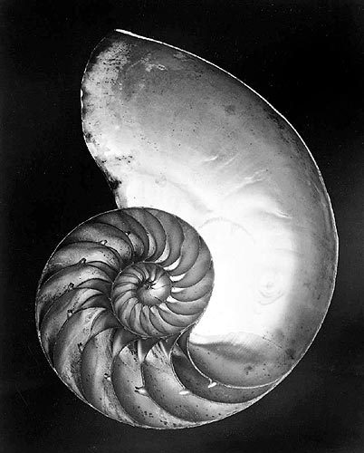
This photograph by Edward Weston (1920) Is an amazing example of the detail and tone that these photographers managed to capture in their work. Even in the darkest shadows and brightest highlights of the subject, there is still great detail visible.

This great attention to detail is something i like to do in my work. When i think of still life, i think of images/paintings that are almost life like when you see them, so its this kind of detail and realism i want to bring to my work.