Showing posts with label city. Show all posts

Tuesday, 6 March 2012

City: Pastiche of Lee Friedlander's "Albuquerque, New Mexico"


For my pastiche, i chose to try and immiate this image by Lee Friedlander. The image shows an almost abandoned cross section, with a dog that looks like it is waiting to cross.

The image was shot on a Leica 35mm camera. For my image, i attempted to try and get the same camera. Unfortunatly due to time constraints, the only camera i had available to me was a Bronica 6x6, so i had to crop my final image in the dark room. Trying to find a location that was similar to this was very difficult. I eventually setteled on a junction in Rochester for the shot.

As this was the only image i needed to take, i didnt make a contact sheet from the film (only 3 of the images came out, 2 of which were full of cars driving past. I tried to catch a break in the traffic, but it was hard as it was on a main road. i started off making a test strip for the image, working at 5 second intivals.


From this, i worked out that that i would need an exposure longer than 20 seconds, so i made another test strip at 20 seconds on Grade 3:


This seemed like a good starting point from which to start working with the grades and creating the high contrast found in Friedlanders image. My next step was to add some Grade 5 to the image to darken the shadows. I realised that in order to get this high contrast look, i would need to drop some of the mid tones in the image, and so made this exposure:


I had dropped alot of the midtones, but there still wasnt enough contrast. I decided to change the first exposure from grade 3 to grade 2 to see what effect it had on the image, and this was the result:


As i was running out of time in the darkroom, i decided to go all out on the image and make an exposure that was guarenteed to increase the contrast: I started by exposing the image at grade 2 for 13seconds, followed by another 22 seconds at grade 5, and this was my final result.

I was happy with this exposure. I realised whilst making this image, that to achieve the same exposure as Friedlander, i would have had to return at a different time of day when the sun was setting and the lighting would have cast more shadows.

Monday, 16 January 2012

City: Shoot and Final Prints

For my City shoot, i chose to use the city of Canterbury. Its a big student town, filled with lots of different people and interesting characters, so i thought that this would be the best place to get the street photography shots i was after. Armed with my 35mm slr, i took to the streets with it round my neck and a caple trigger in hand and began shooting. I shot 3 rolls of film, but for some reason, only one of them came out, the others came out completly blank.


I had set the shutter speed to 1/60th of a second, and the aperture wide open at f3.3. This was because it was a dark overcast day. Also, i felt that the bluring in the images would help to emphasize the fast pace of city life. Unfortunatly, this also meant that the fast majority of the images were just blurry and not really useable. Out of the images i managed to pick out 5 that i felt worked best.


As all of the images were taken with the same exposure settings, i tried to make prints using the same settings to keep them all looking the same. I found the perfect exposure time was 10 seconds, and to add some contrast, i split that 5 seconds on grade 2, and 5 seconds on grade 5.


Thursday, 12 January 2012

Environment/City: Critical Appraisal


For my environment unit, I chose to look at the effect that we have on the environment. I started by researching the artist Mitch Epstein. His work depicting the growing population of China, and its effect on their landscape was my main inspiration for the project. After the critique of my first shoot, I realised that I needed to continue shooting, as my first images didn’t show this idea of expansion. I wanted to build up a much larger collection of images for this project, but I struggled in finding places that matched what I wanted to photograph. After my second shoot, I had 3 images I was happy with, although I had had to shoot them on a 35mm camera. Due to this I printed some of the images smaller to retain detail, but I was overall happy with my final prints.

The city I found a lot more difficult. My initial thoughts for the project were to look at the unseen parts of the city, but due to an error whilst shooting, I had to complexly rethink my approach with the time I had left. It was at this point that I came across the work of Bruce Gildan, who specialised in street photography. I started to shoot around the city of Canterbury, photographing people walking the streets without making myself to obvious. I shot a single roll of black and white 35mm film, and managed to take 5 images I was happy with. I had wanted to use medium format for the shoot, but the relatively small size of the 35mm slr meant that I could be as inconspicuous as possible.

Wednesday, 11 January 2012

City: Bruce Gildan

Bruide Gildan is a modern day street photographer,. who is famous for his work in New York City. His style is catching people off guard in the streets, usually approaching them up close with a flash when they arent expecting it. This approach is very different to most street photographers, as they try not to alert their subjects to the fact that they are having their picture taken.
His work is all taken on 35mm, black and white film, and has a very grainy feel to it. This is key in understanding what his photos are trying to show. He has said that "when you can smell the street through the photo, then it's street photography". He looks for characters on the street, people who are more interesting than everyone around them. Its this that i want to try and capture through my work, as i believe that the people make the city and not just the buildings. However for my photos, im going to take the opposite approach, and try and be as descreet as possible with my camera.

Friday, 6 January 2012

City: Street Photography

Street photography is a really interesting concept to me. It seems to be the only way to get an honest representation of the city and the people who populate it. Ive been looking at the work of Henri Carter-Bresson. He pioneered the field of modern photojournalism, taking to the streets with his hand held camera, and taking pictures of every day happenings around the citys. 


This image was taken in Hyeres, France. Carter-Bresson's idea with his pictures was that the camera was an extention of his own eye, and that he was capturing eternity with his images.This is a perfect example of this. Without the use of a camera, this cyclist would have just passed by unnoticed, and not been remembered. A big part of what made this style possible was the introduction of the 35mm camera. Carter-Bresson liiked the annonimity that the small camera gave him in confined/packed spaces. It helped him overcome peoples natural reactions to being photographed. As soon as you dont know you're being photographed, you become more yourself, and less what you want people to see.

With this in mind, id really like to explore the world of street photography for my project. To me, the people in the city are what makes the city, more than the buildings or area. This way i can show the different sides of the city and who is in it. Because i want to keep up this annonimity, i will aim to use my 35mm camera for the project.

Monday, 26 December 2011

City: Anton Furst


For this project, i am trying to show the darker side of the city. I looked at how the city is portrayed in films and television, and came across the designer Anton Furst. He was the production designer for the Tim Burton "Batman" films, for which he won an oscar. His dark noirish nightmare styled sets are a massive part in showing Gotham City as a dark place run by criminals.

These scenes are not unlike some parts of modern cities. The idea behind these designs is that the city was constantly expanding, and being built upon. Because of the lact of space, the city was built upwards on top of existing architecture. This is very similar to the expansion of New York City, which grew up as the population increased and space became less available.

In most of these scenes, the city is shown at night, and it made me think about how the city takes on a completly different dynamic. I want to try and show these changes in the city, comparing the differences between the daytime and night.

Tuesday, 29 November 2011

City: Deconstructing Environmental Photographers Pt 2


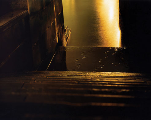
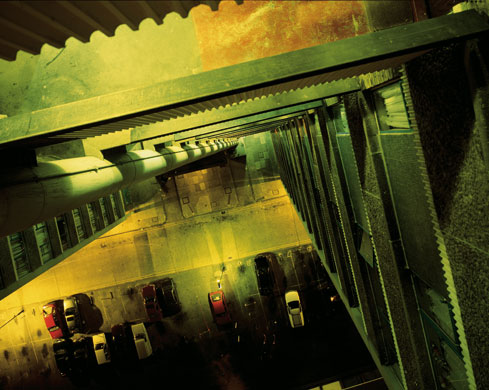
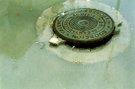
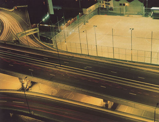
The first phtoographer im looking at is a german photographer called Rut Blees Luxemburg. As i have already researched this artists for this project, taking my main inspiration for my own work from her, i am well farmiliar with her techniques and concepts. Her work mainly explores the urban landscape at night, just using the lights available(streetlights/city lights), and slow shutter speeds to create her images. Her earlier work looks at the city in a much larger context, showing the hidden areas that you would not usually see. She does this by distancing herself from the loction, and including the busy city scape around it. In her earlier work Liebeslied (which translates to "Lovesong" in english) She approaches the city in a more intimate way. The same techniques are used, but the subjects of the images are completly different, focusing on the small details such as puddles and reflections of buildings.


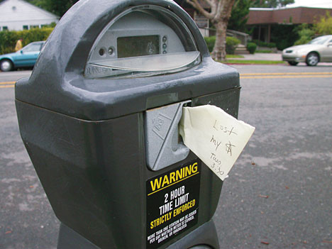
The second person i will be lookign at is Richard Wentworth, a british artist and sculptur.His photo series, Making do and getting by, vastly differes from Rut's work. Its main focus is on the everyday objects we see and use all of the time, but being put into a situation or being used for a purpose that they were not designed for. For example, a book being used to balance a table, or a boot being used as a door stop. The work starts to challenge our ideas of what these objects symbolise in their new positions. Unlike most of Rut's work, there is also a more defined anrrative within eash of Wentworth's images.


The final artist is another german born photographer, called Vera Lutter. Her work is again completly different to those of the previous two artists. Her images are created by using a room as a camera obscurer, and hanging large pieces of black and white phtoographic paper on the opposite wall and making large negatives of the view. These images are one off pieces, and are always negatives. This is the most litteral view of the city, as the images rely heavily on the room in which she is taking the picture from. Her work simplifies the city to just the buildings and surroundings. The extremly long exposure times needed to create these images mean that all life/movement in the image is lost, and all that is left is the defining buildings. Out of the 3 artists, i believe this work is the most honest and true representation of the city. The others have the luxury of being able to focus on elements of city life or the landscape. This work shows the city stripped of its people and shown at its rawest form, both in the sense that it is void of movement, and also that it is portrayed as a negative and void of colour.

Monday, 21 November 2011

City: Deconstructing Environmental Photographers

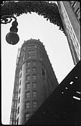
The first image is "the Flatiron, New York" by Edward Steichen, taken in 1905. The composition of this image is very condisered. The photographer has chosen to show the building as a part of the background of the image rather than in the foreground, which is taken up by tree branches and people walking around. The image was taken in a time when the population of new york city was on the rise, so the city was expanded up rather than out. The building isnt contained in the image, just being cut off at the top, which emphasises the height of this towering structure. The original image was a platinium print, to which Edward added colour to create the twilight effect that isnt very clear from the original print.


The next image is by Alfred Steiglitz. This image was taken about 2 years before the previous image, and so was still around the time of this New York skyline expansion. Again this image has a very considered composition, the use of horizontal lines emphasizing the height of the building. The foreround is dominated with trees and nature. Even the crop of the image ephmasizes the buildings height, being cropped to be very tall and thin. The image looks as though it has been taken at a very low aperture as everything from background to foreground is in focus.


Alvin Landon Coburn takes a very similar approach to photographing the building as the previous 2 artists, featuring it in the background, with trees and people being predominant in the foreground. the building again is shown as this towering structure on the skyline, although the people in the image appear oblivious to it as if its of no real importance.


The fourth image takes a completely different approach to the previous 3. It is taken by Walter Gropius in 1928. Where as the previous images are very dark, and speak of the hardship that the country was undergoing at this time, this image is more in admiration of the building. It features just the building, but at an angle, almost like the composition wasnt important, only that the building fit in the image. Of course this wasnt the case, as the artists took time to compose this image.


`this image by Walker Evans is probably the most set apart from the rest of the images. Although it does feature other things in the foreground, such as the light and the other building, it also focuses specifically on the building, so you see the detail of the building. This image was also taken in 1928.


Finally this is an image by Berenice Abbott, taken in 1938, the most recent of the images i have looked at. The tonality of the image is very similar to that of Walter Gropius' image, although the composition is different, and presents the building in a different way.  Where at Walter's image portrayed a certain instability, this image gives a sense of strength. As this was around t he time that america was starting to get back on its feet financially, this could be what the image is representing.

Wednesday, 12 October 2011

The City: Rut Blees Luxemburg

The work of Rut Blees Luxemburg first came to my attention because of this photograph. It was used on the album cover for the Bloc Party album "A Weekend in The City". Her work mainly explores the urban landscape at night, which is a subject i have explored myself. I find that the urban landscape in many ways can be just as beautiful and interesting as any other location, so it is something i would like to explore for my Environment project.
The use of tripod and long shutterspeeds allows her create these images only using the streetlights, and not by using artificial flashes.
In this particular image, it looks as though the artist has tried to portray the area as struggling, lower working class part of town. It shows what looks like a shipping container, with a table and chair inside in a carpark on some city back streets. This could be maybe somewhere a parking attendant would be, or even possibly somewhere where a homeless person might live. The location of the container, and the difference in colour between it and everything around would suggest that it is misplaced in this area, but through further analysis of the image, you can see a crane in the background, which links it in with the idea construction working going on. Most of her images are taken in and around city centers, so this is a typical location for this image.