City: Deconstructing Environmental Photographers
The first image is "the Flatiron, New York" by Edward Steichen, taken in 1905. The composition of this image is very condisered. The photographer has chosen to show the building as a part of the background of the image rather than in the foreground, which is taken up by tree branches and people walking around. The image was taken in a time when the population of new york city was on the rise, so the city was expanded up rather than out. The building isnt contained in the image, just being cut off at the top, which emphasises the height of this towering structure. The original image was a platinium print, to which Edward added colour to create the twilight effect that isnt very clear from the original print.

Alvin Landon Coburn takes a very similar approach to photographing the building as the previous 2 artists, featuring it in the background, with trees and people being predominant in the foreground. the building again is shown as this towering structure on the skyline, although the people in the image appear oblivious to it as if its of no real importance.
The fourth image takes a completely different approach to the previous 3. It is taken by Walter Gropius in 1928. Where as the previous images are very dark, and speak of the hardship that the country was undergoing at this time, this image is more in admiration of the building. It features just the building, but at an angle, almost like the composition wasnt important, only that the building fit in the image. Of course this wasnt the case, as the artists took time to compose this image.
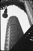
`this image by Walker Evans is probably the most set apart from the rest of the images. Although it does feature other things in the foreground, such as the light and the other building, it also focuses specifically on the building, so you see the detail of the building. This image was also taken in 1928.
Finally this is an image by Berenice Abbott, taken in 1938, the most recent of the images i have looked at. The tonality of the image is very similar to that of Walter Gropius' image, although the composition is different, and presents the building in a different way. Where at Walter's image portrayed a certain instability, this image gives a sense of strength. As this was around t he time that america was starting to get back on its feet financially, this could be what the image is representing.


No comments:
Post a Comment